

Seeing in Black and White
Our view of the world was forever changed in 1825 when Joseph Niepce coated a metal plate with a light-sensitive material, waited 8 hours, and recorded the first photographic image. While most of us don’t have that kind of patience, nor do we use metal plates, enthusiasm for the black and white process has always endured.

© Joseph Niepce
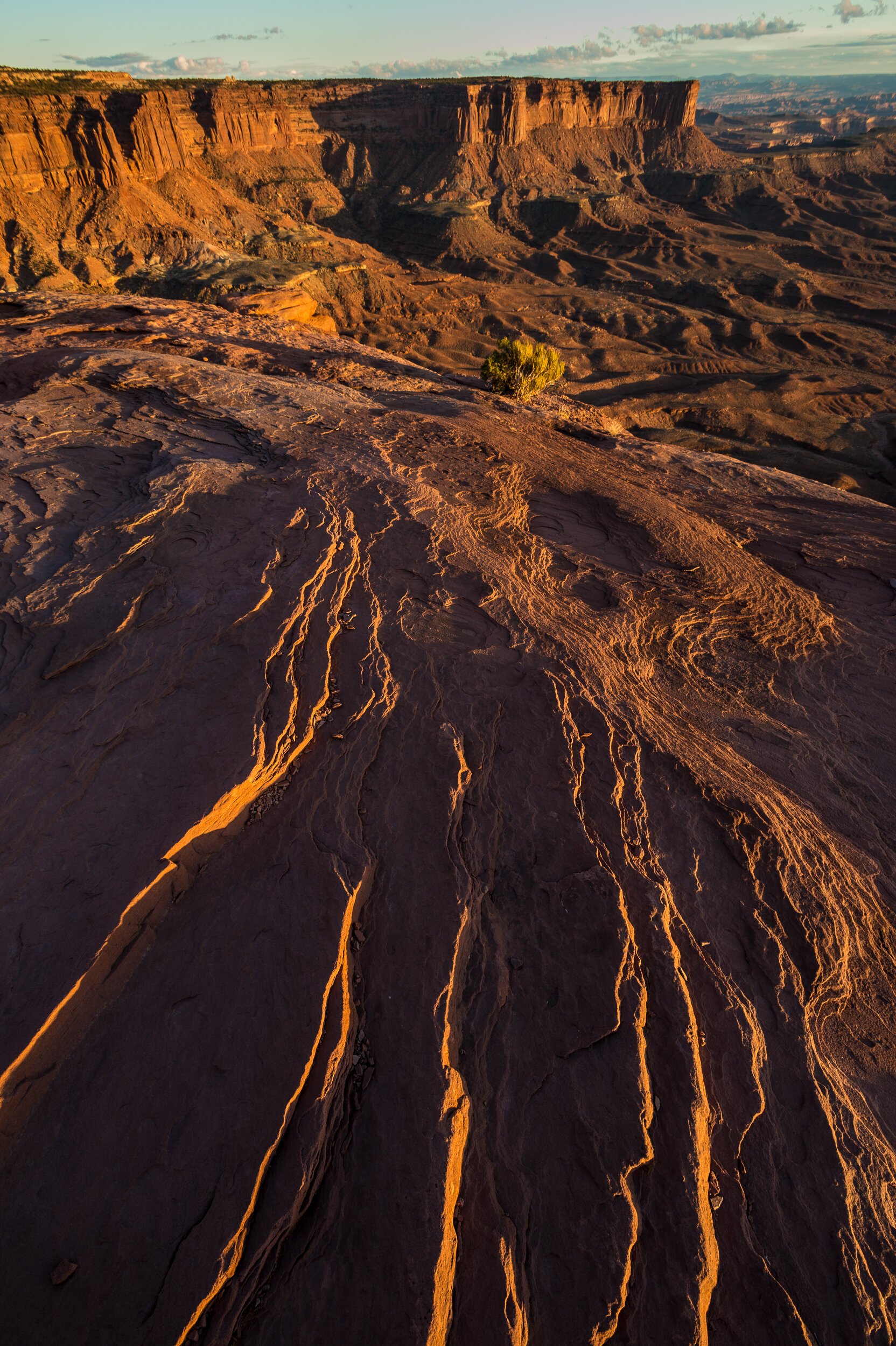
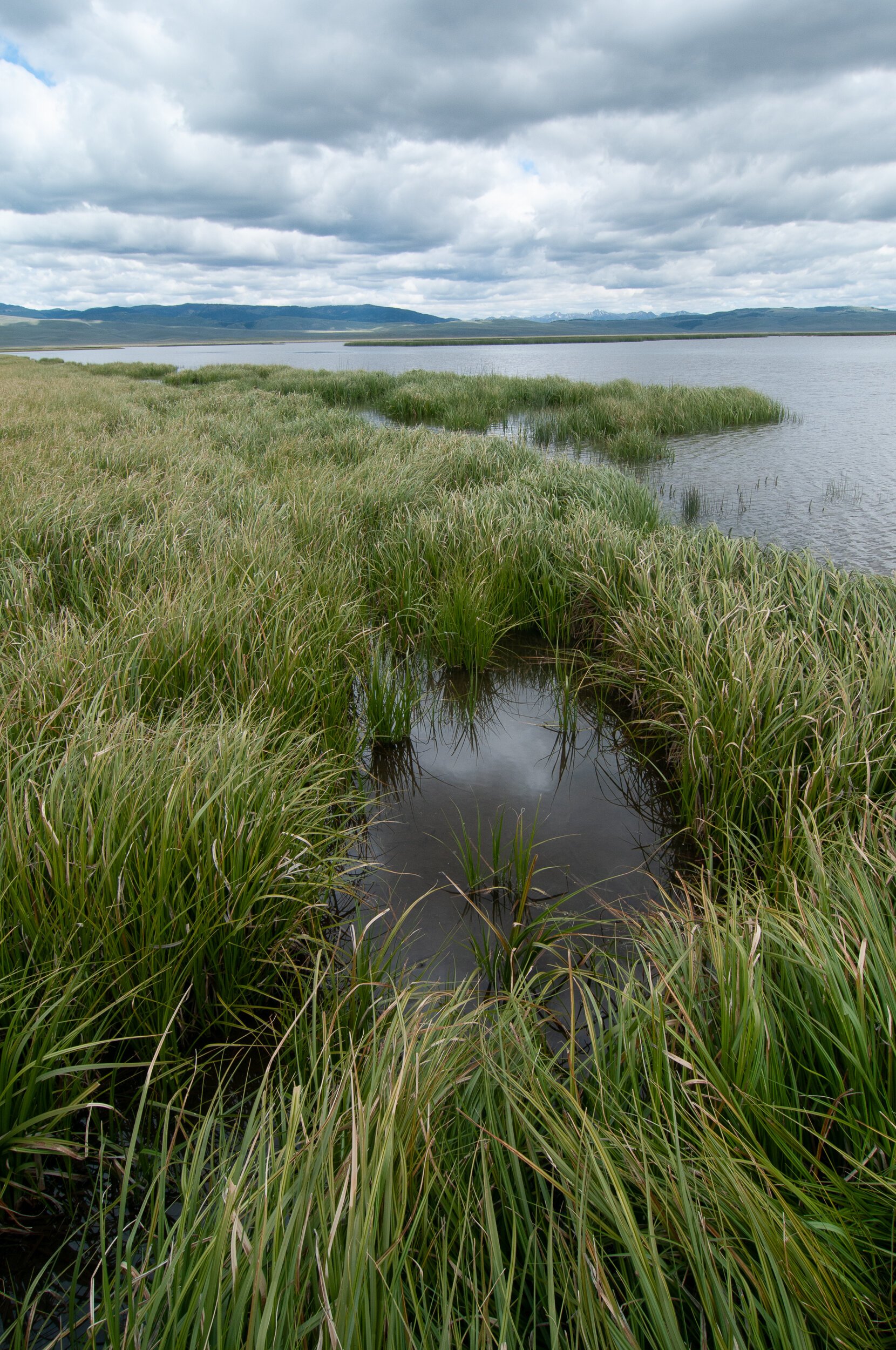
The presence of Color in a photograph can be a very compelling visual element, but color can also make it more difficult to notice underlying elements that can be more important to the success of a photograph.
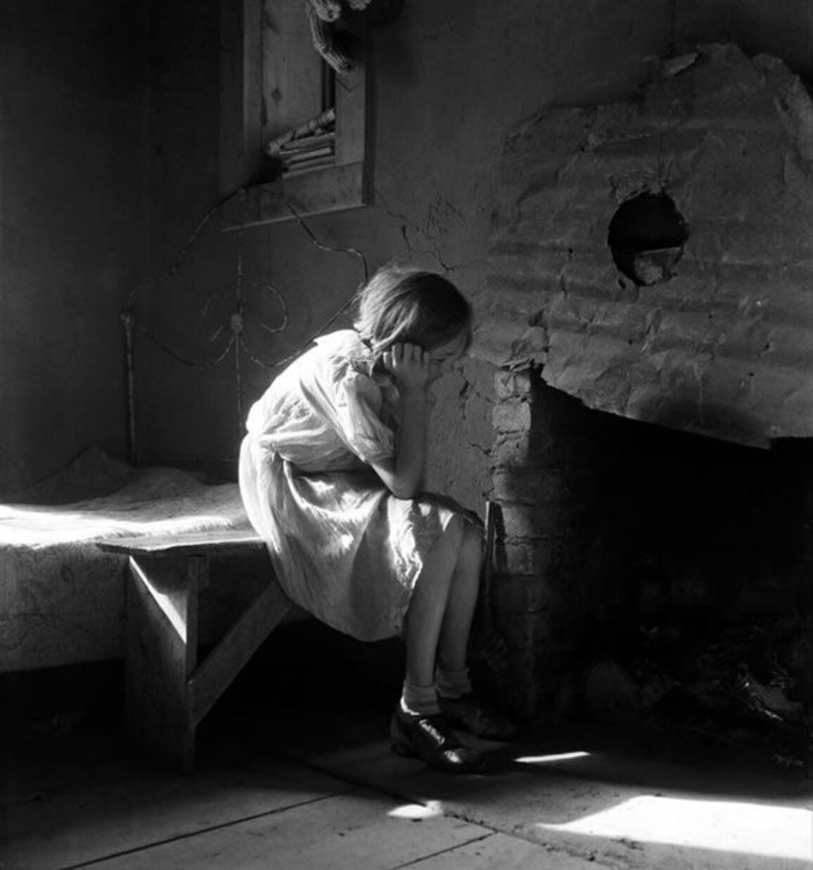
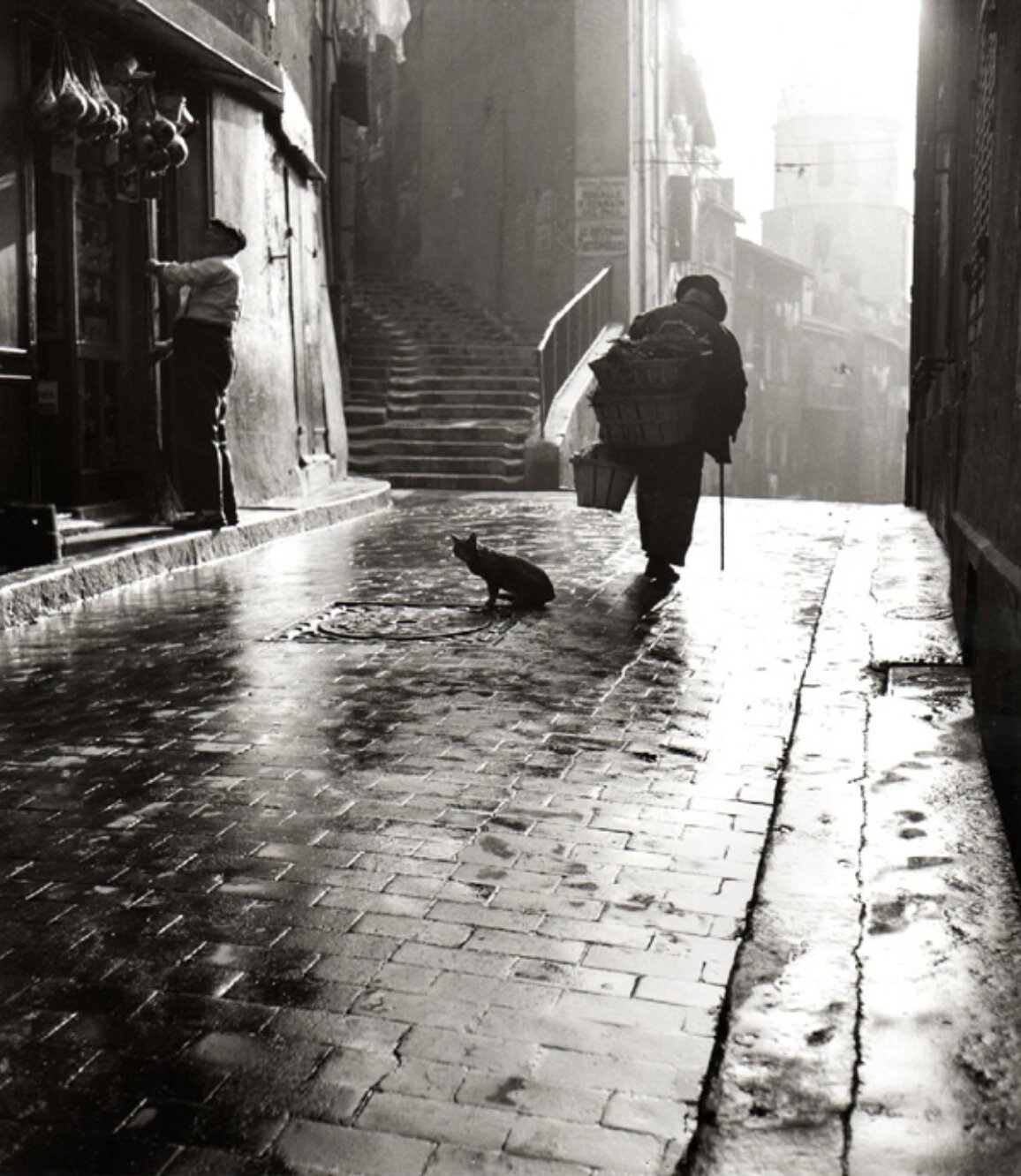
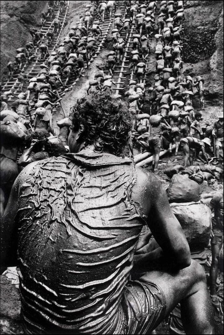
I like to think of exploring black and white photography today in three ways. One, we can study the most iconic and enduring images of the 19th and 20th centuries are black and white photographs. Many of the most iconic photographers throughout history strictly shot with the black and white film even after color film was created in 1907. This list includes masters like; Dorothea Lange, Henri Cartier-Bresson, Ansel Adams, and Sebastiao Salgado to name just a few. When we study these photographs and the Masters who created them, it gives us a road map to strengthen our own paths of communication.
Two, as the black and white medium evolved through the centuries, different processing techniques were developed to create a more archival and more refined outcomes. Some of these processes like, selenium tone and sepia tone and the silver gelatin process are still revered and replicated in today’s film and digital processing environments.
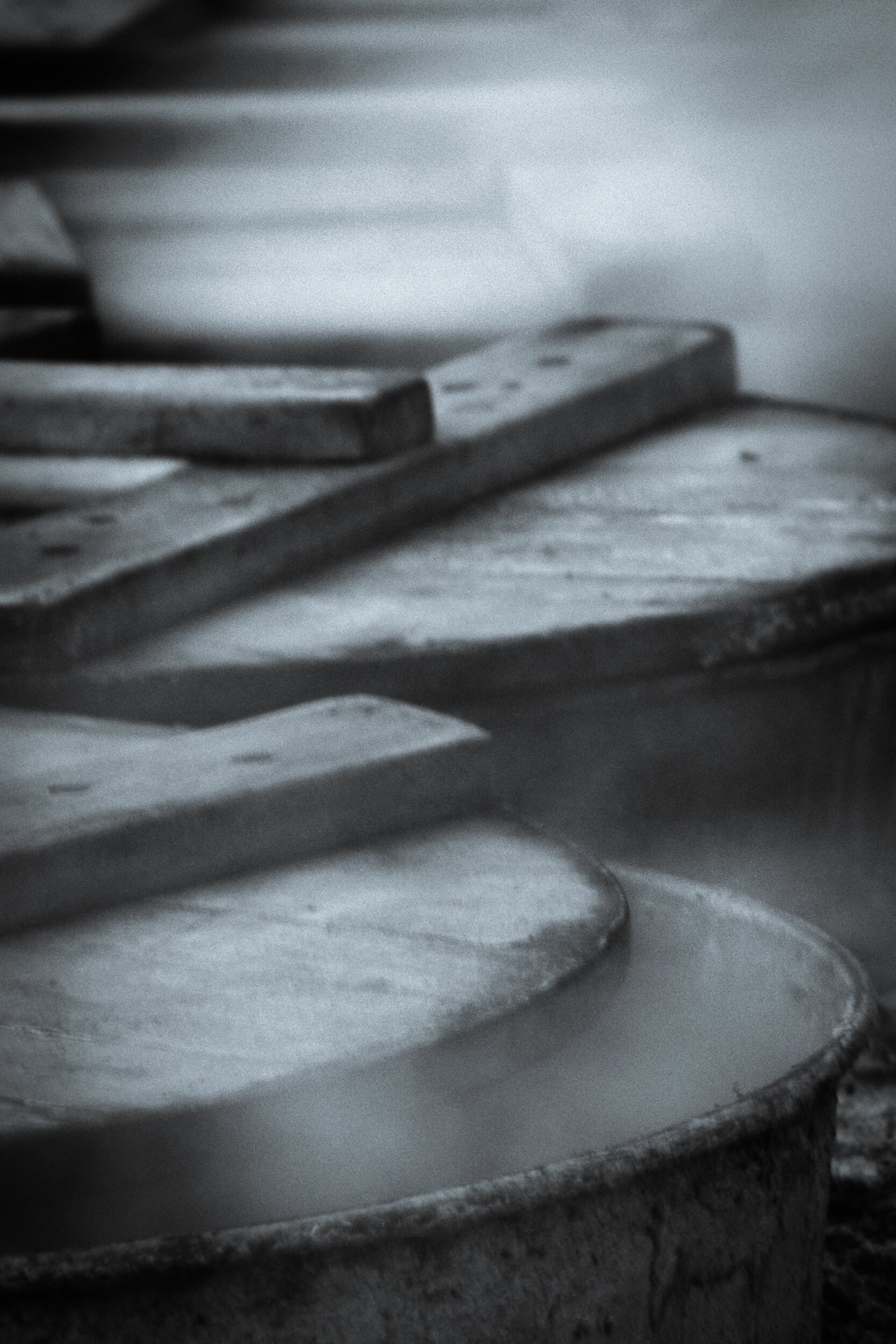
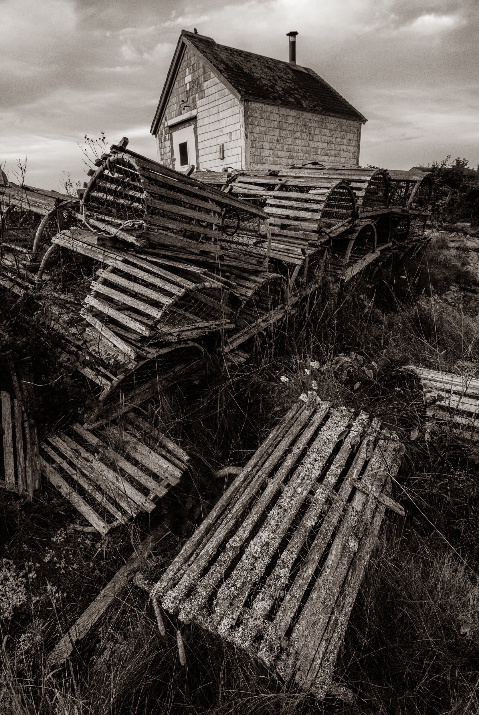
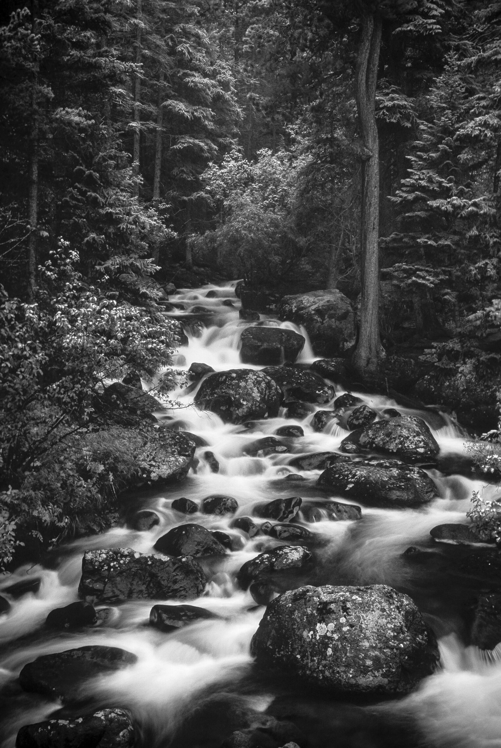
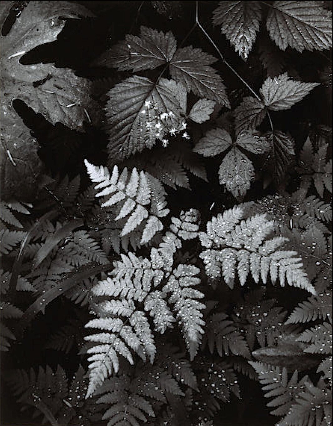
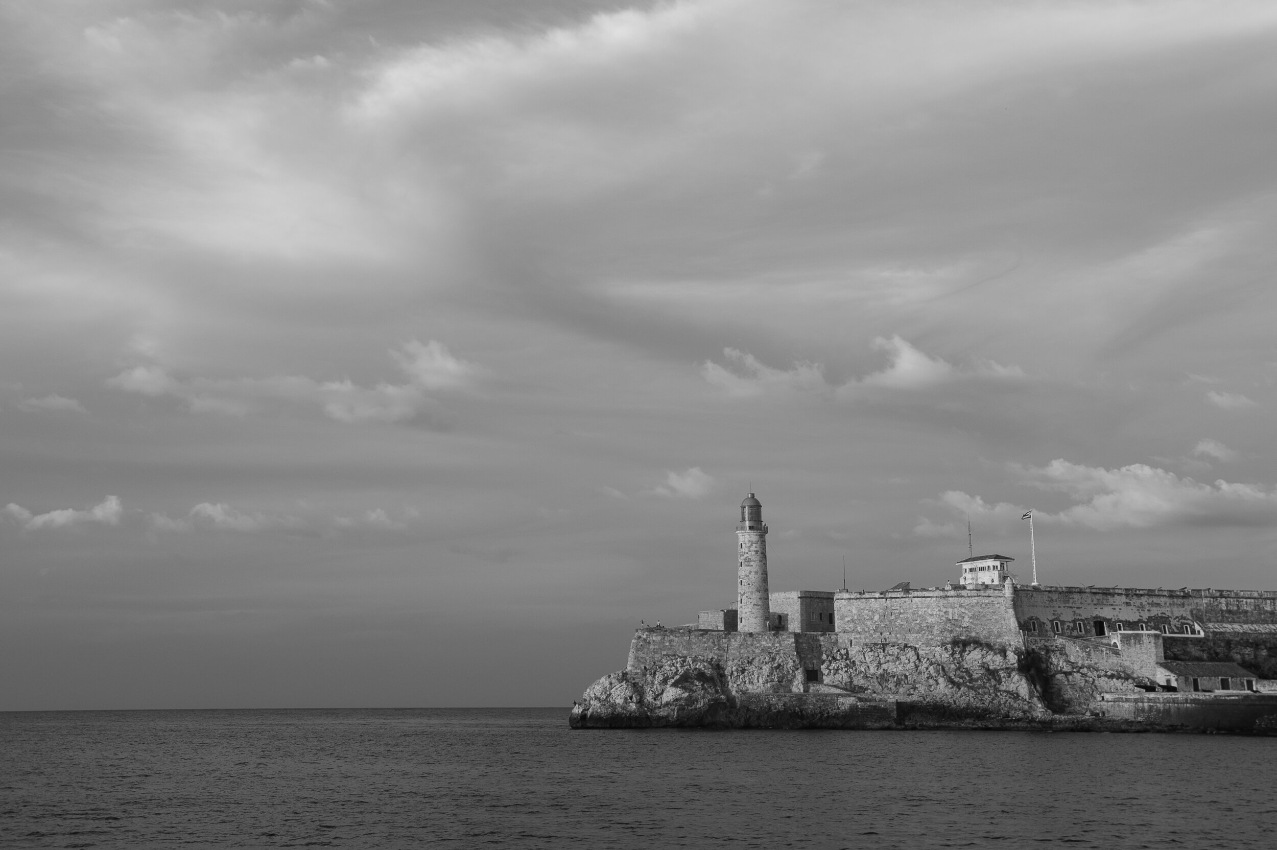
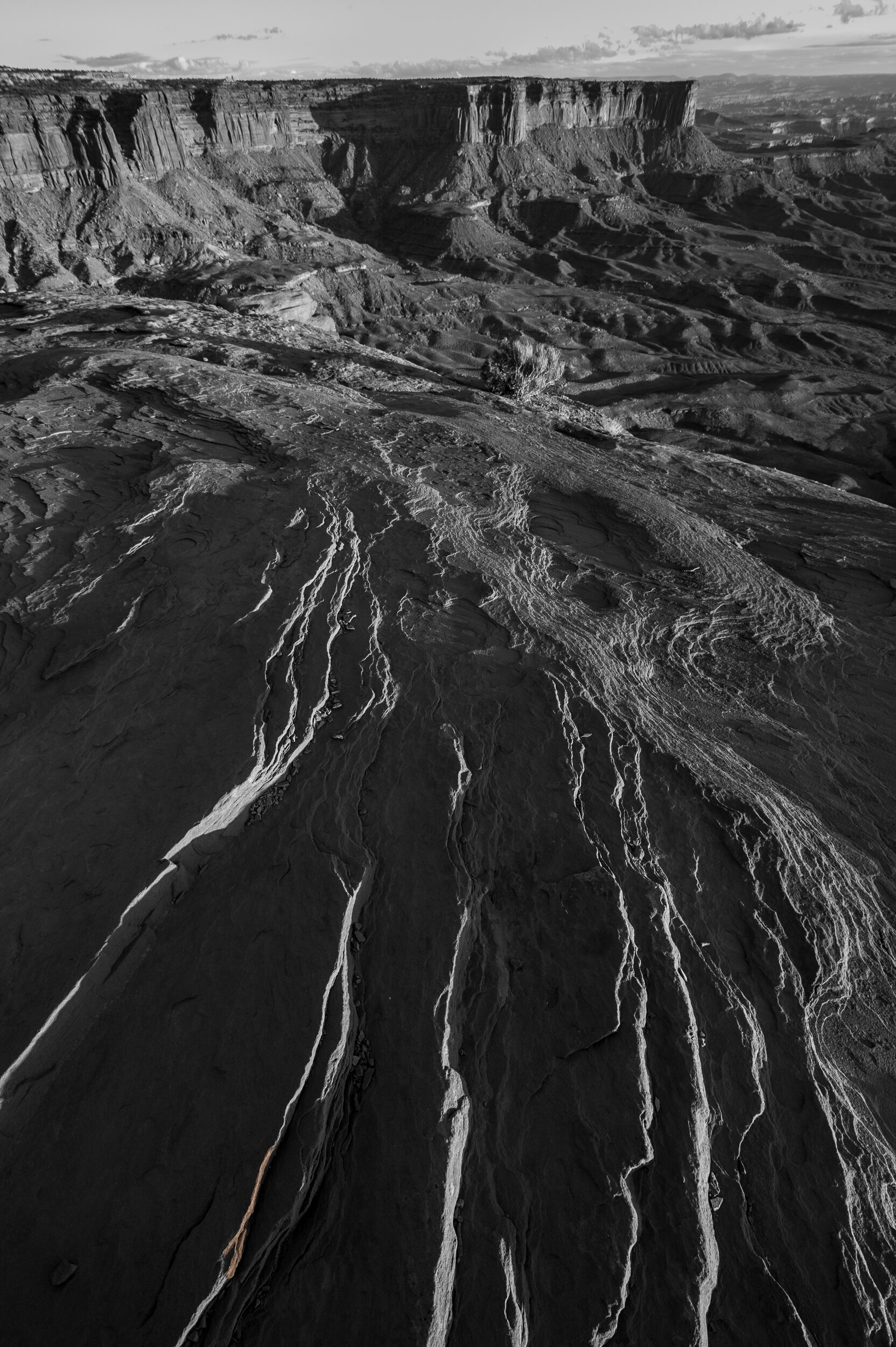
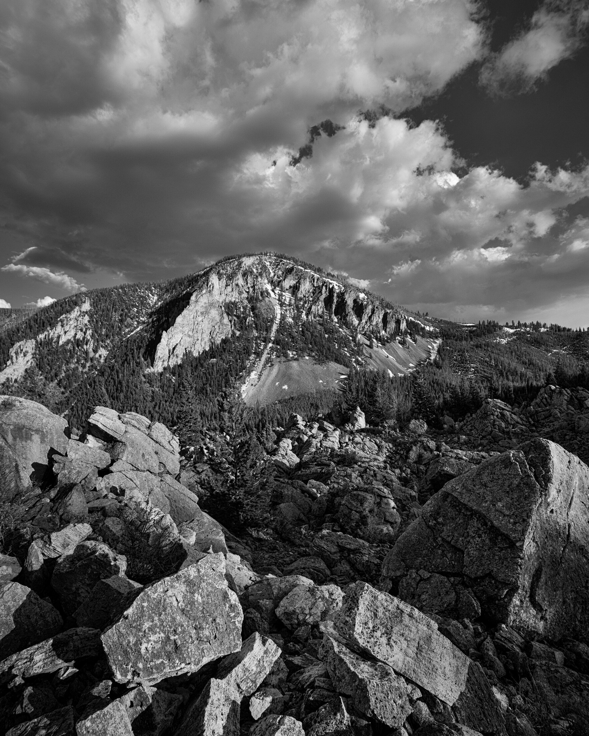
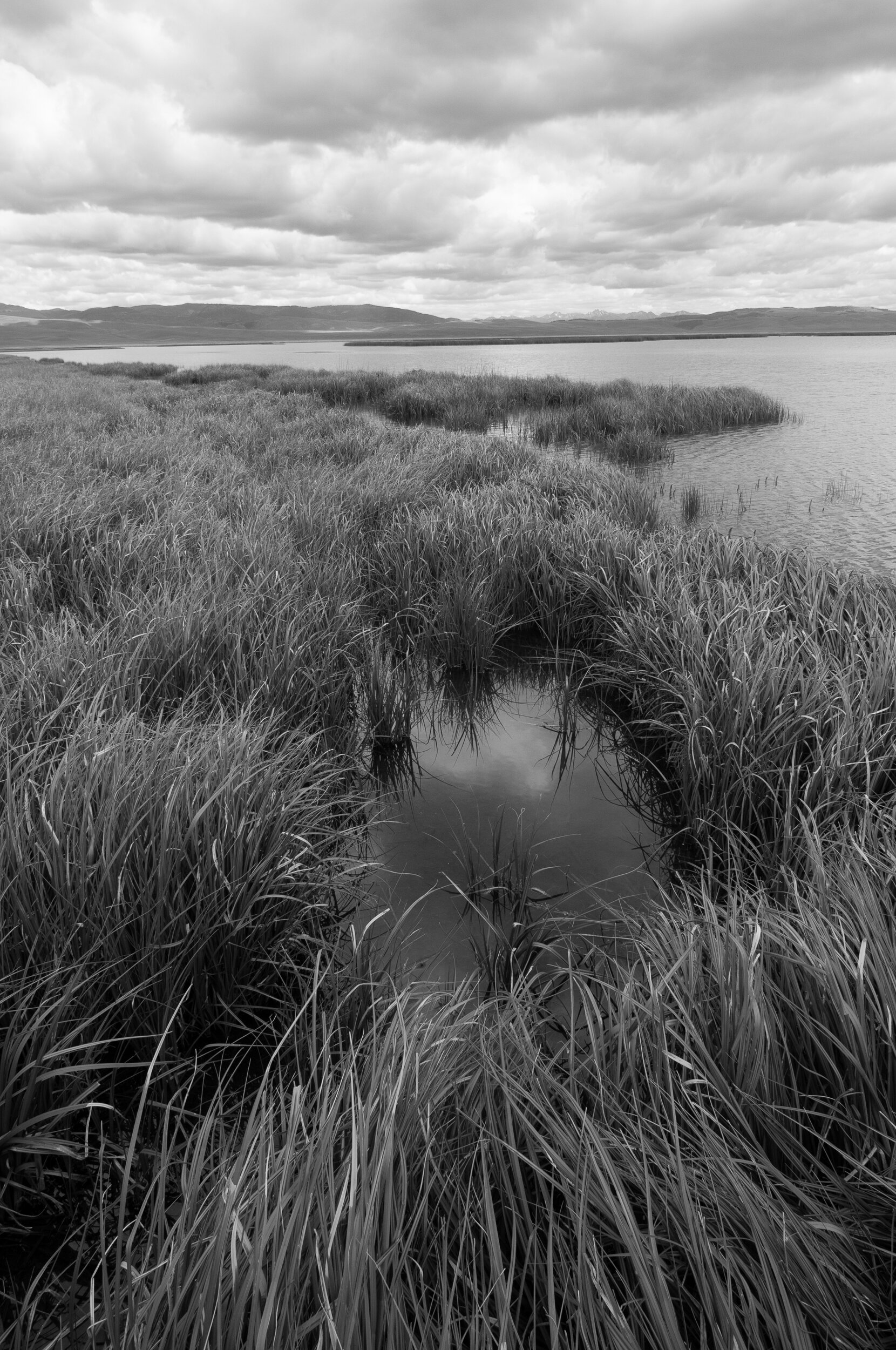
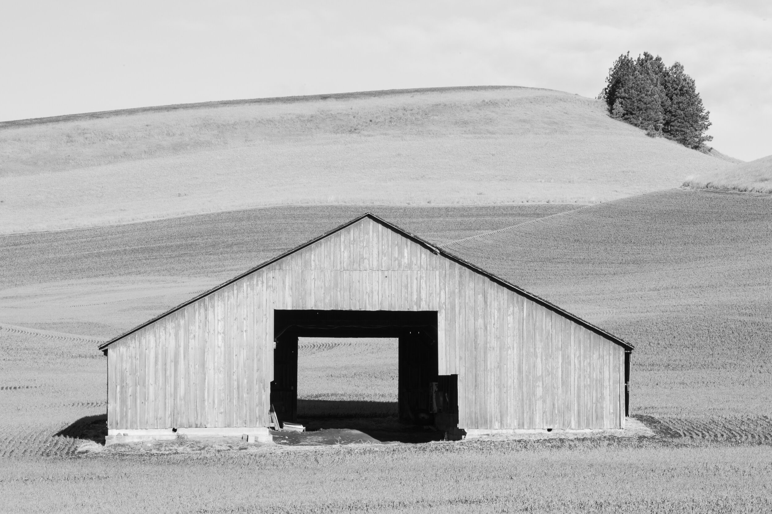
Three, the aesthetic value of a black and white image can feel more refined, because of the emotional impact color can mask other important elements. Grayscale photographs distill the subject matter to the core of compositional elements; light, shape and form, line, texture, and negative space, even the decisive moment can be negatively influenced by color. In the grayscale world, these visual elements become much more powerful visual tools for self-expression.
I ask one question when I’m considering whether the subject matter will make a good black and white photograph. Is the color in the scene and or subject matter consequential enough? Meaning, is it really all that important to your story? If the answer no, then black and white it is!
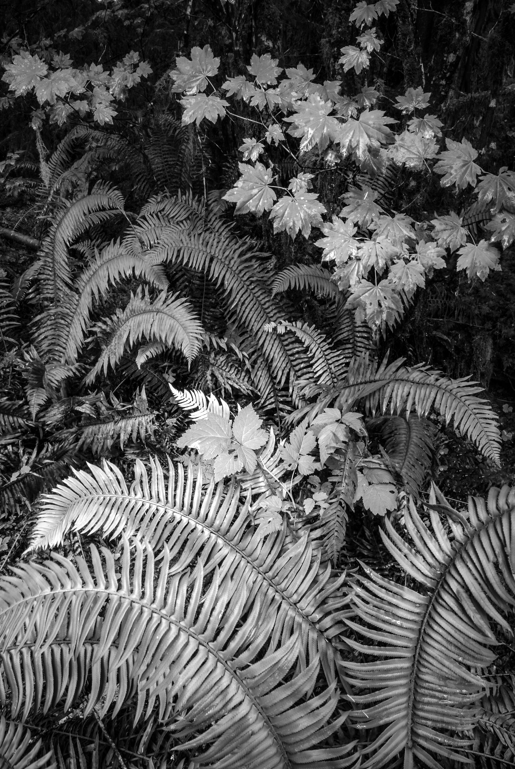
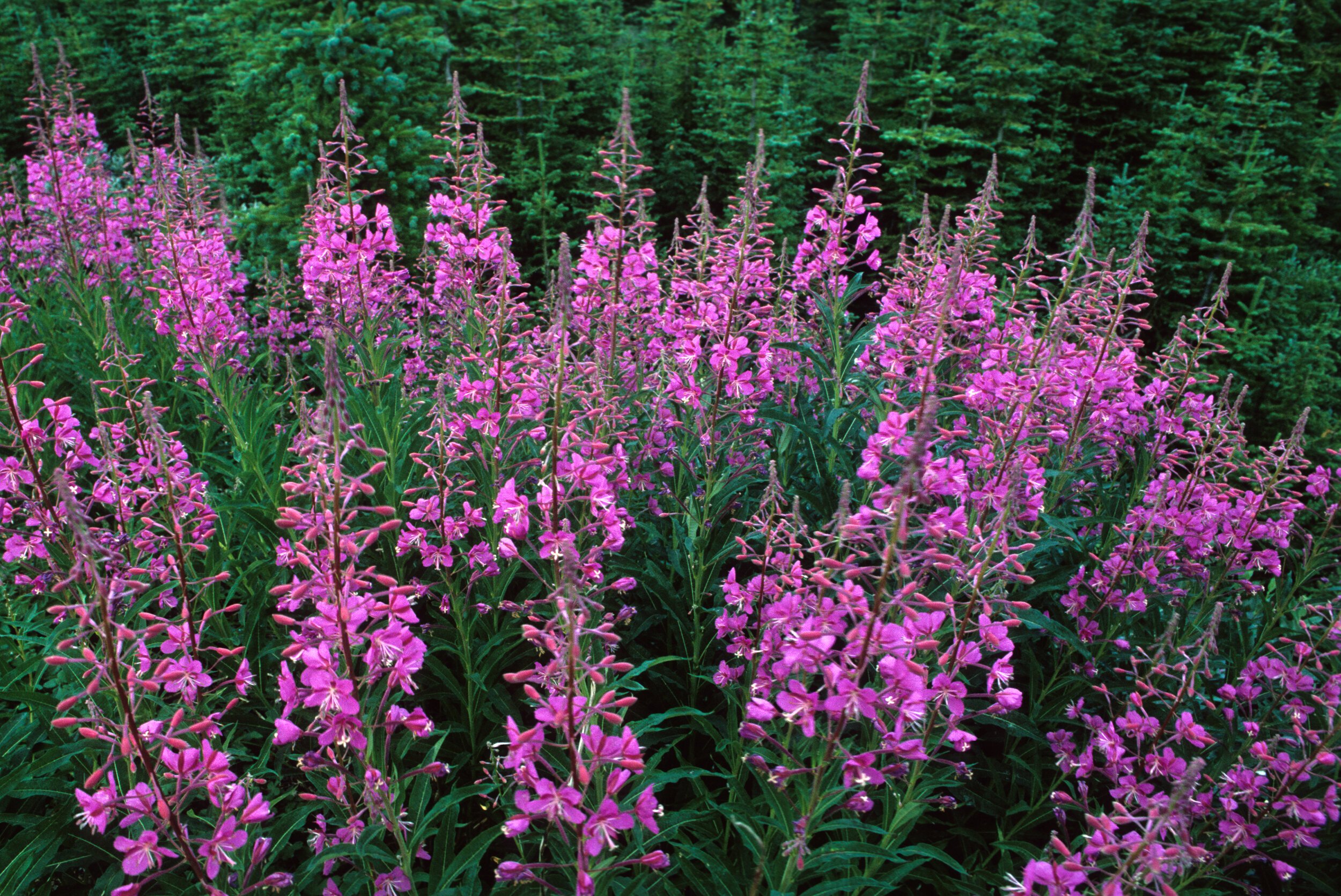
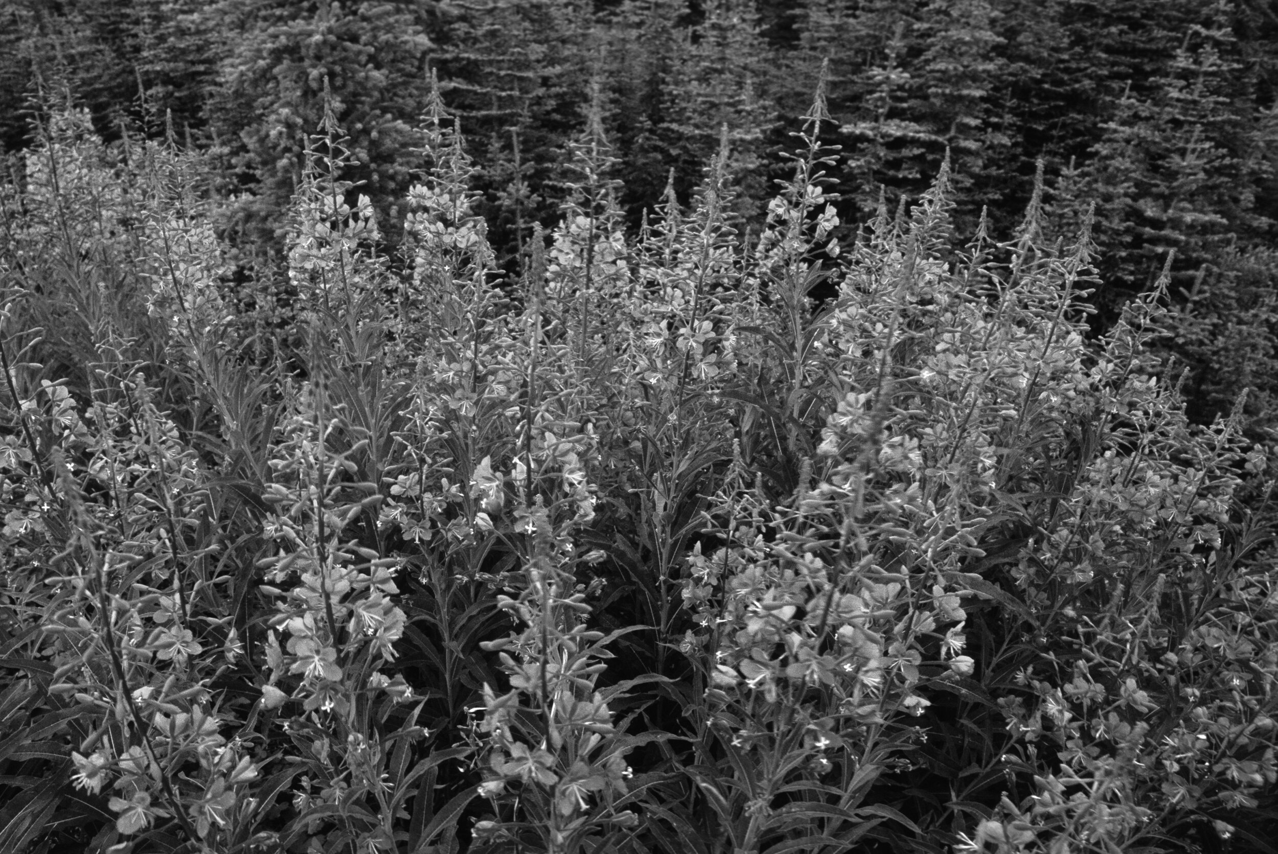
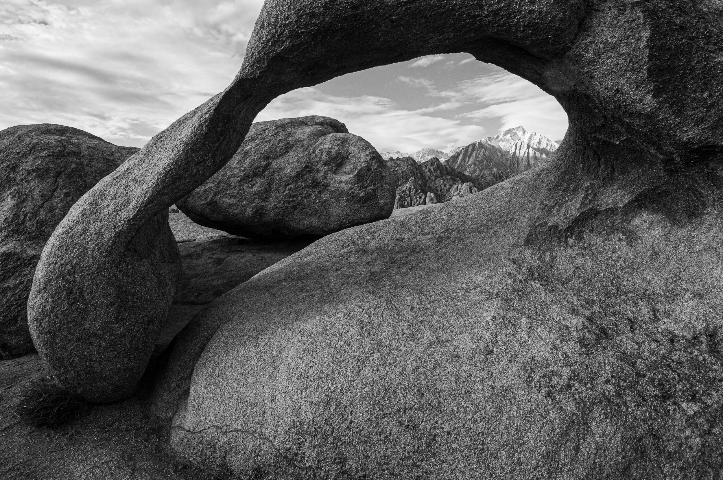
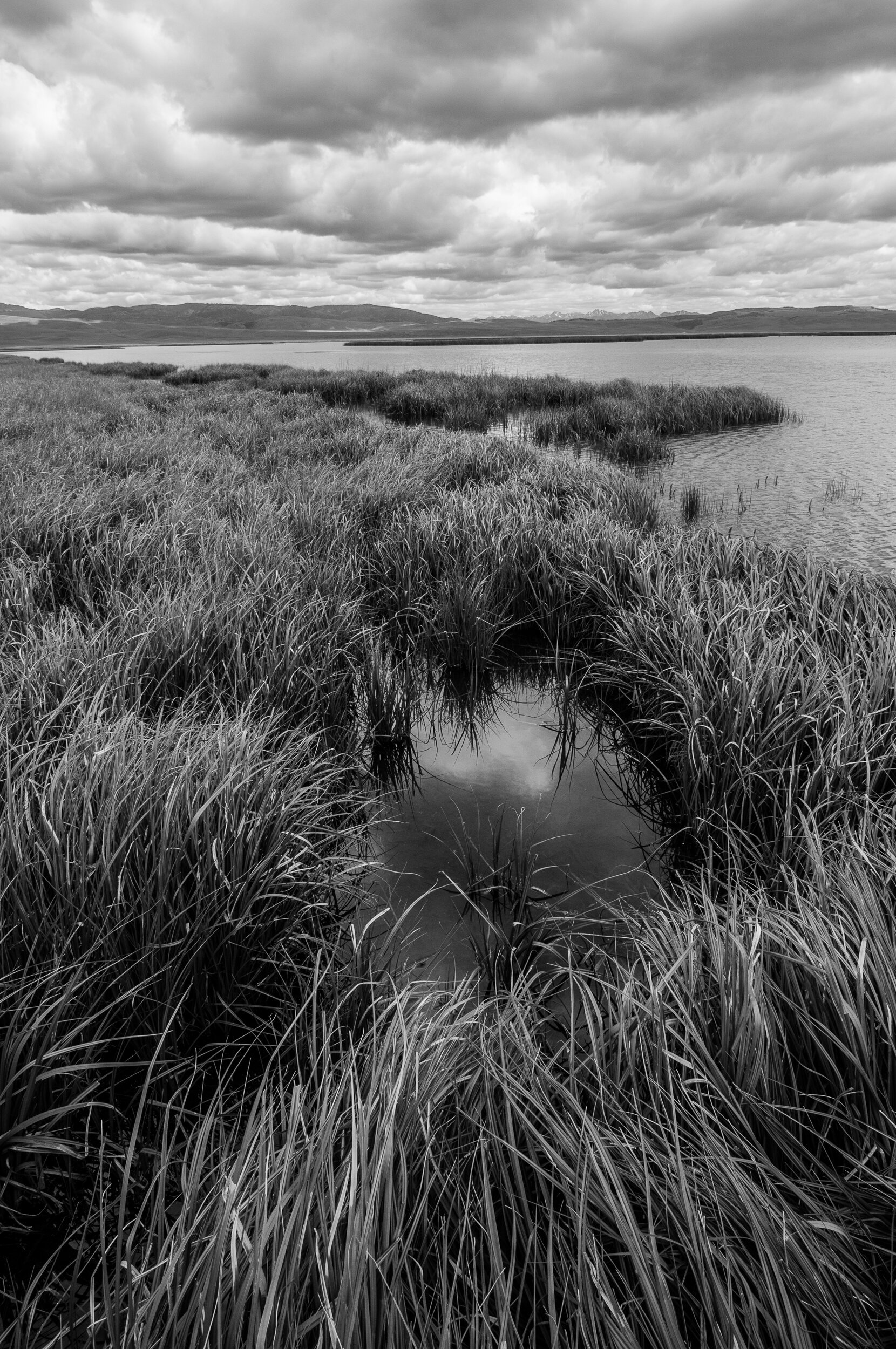
One of the biggest challenges to overcome after converting many color images to grayscale (black and white) is a noticeable loss of contrast. When color is present, complementary colors provide significant contrast from the visual movement of warm colors (move forward) and cool colors (recede). When the scene is converted black and white, we longer benefit from the visual movement associated with color, especially if the colors are similar in tone (brightness). A lack of contrast makes our photographs appear “flat” or lack depth.
I consider two solutions when confronted with this limitation.
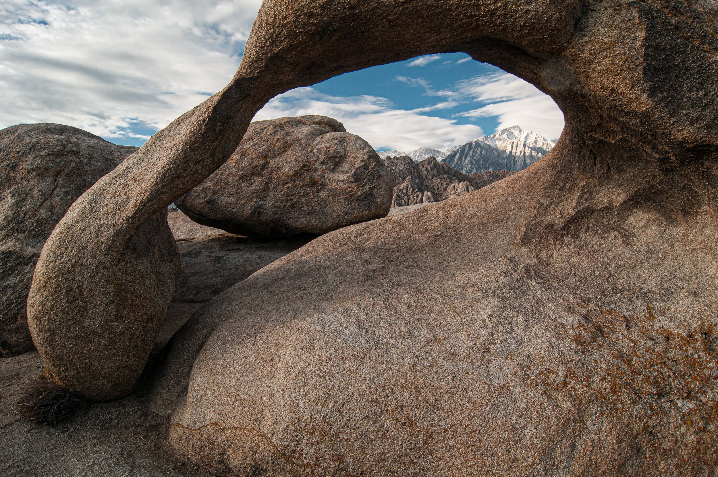
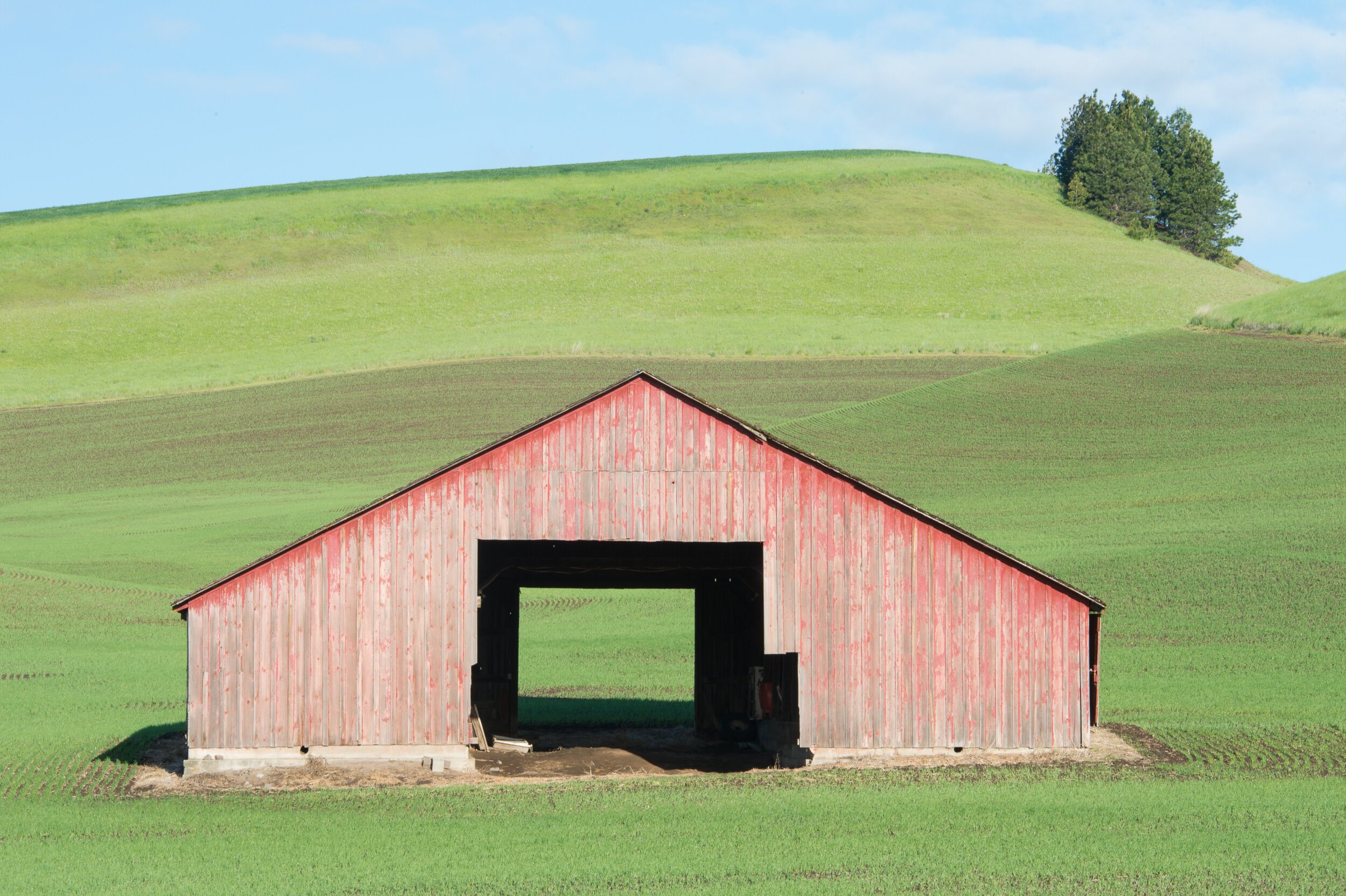
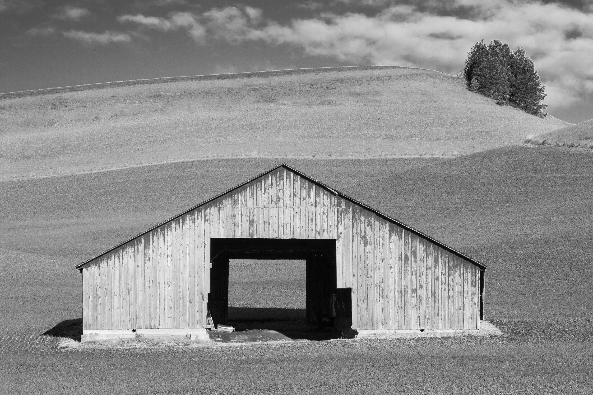
One is to shoot higher contrast scenes when the light provides stronger highlights and shadows and the angle of light is important too. This occurs after sunrise and before sunset (with few clouds) when the hard-direct light illuminates the highlights and cast long deep shadows. My attention also turns to black and white during the day, when the color of light is not exciting, but the contrast is still strong. If your work involves the studio, you are responsible for controlling the contrast. Tonal contrast (brightness) has similar characteristics to color contrast, meaning brighter tones (move forward) and darker tones (recede).
If you shoot in a JPEG file format, you’ll want to convert the file in the camera to Monochrome (black and white). This setting is usually found in a Shooting menu/Picture Controls or Picture Styles. From there you might have an option to customize the amount of contrast applied to the file using the contrast adjustment or filter effects.
If you shoot in a RAW file format, you will enhance contrast in an editing software on your computer. In Lightroom. Photoshop and other applications, the contrast slider adjusts overall contrast and we can apply contrast more selectively by brightening just the whites and or highlights or by darkening the shadows and blacks with individual sliders.
If you are working in Lightroom (LR) or Photoshops Camera Raw (PSCR), one of the most powerful contrast adjustment tools is the Black & White Mixer. To access this tool, the file must be converted to grayscale by clicking on one of these conversion options;
1. B&W Presets (LR-left panel) or
2. Monochrome Profiles (LR/PSCR-right panel) located near the top of Basic Panel
3. Black & White tab (LR/PSCR) located at the top of the Basic Panel
*Each preset and profile either add or subtract contrast to varying degrees.
Once the file has been converted, open the Black & White Mixer (LR-right panel) (PSCR-directly below-histogram) and here you have full control over the tonal brightness of a specific color that still exists under the “surface”, but is not seen in the preview after conversion. This is the solution to manage the lack of tonal contrast between colors with similar tones (brightness) after conversion that I mentioned previously in this article.
Now that we know which scenes to consider and how to overcome a some of the challenges when we convert a black and white in camera or on the computer, we can take the next steps and begin to create exciting and meaningful black and white photographs. I invite you to join me for a fantastic online weekend workshop, the Power of Black & White January 29-February 1, to really advance your skills in seeing and processing black and white photography!
Let’s get started,
Doug